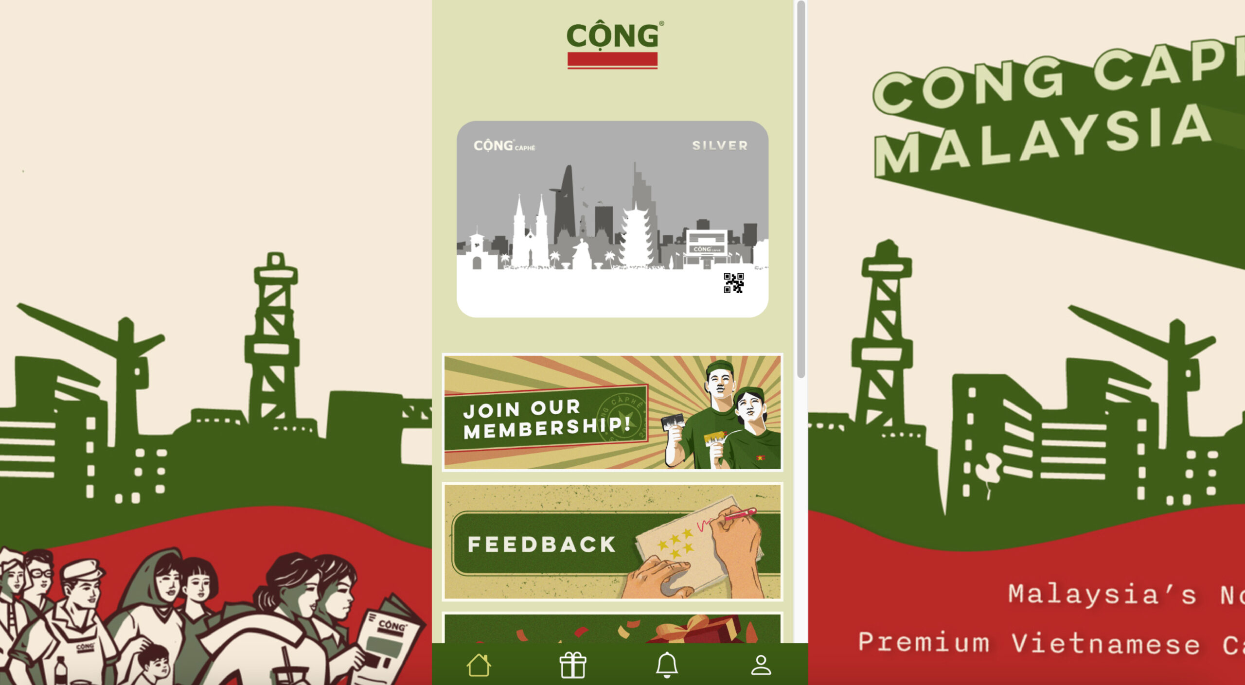
Top 5 UI Tips in Designing Your Membership Portal
Craft a Membership Portal Users Love. Boost member satisfaction and keep them coming back for more with these UI design tips.
Your member’s portal is the first touchpoint your users would experience when engaging with your brand’s loyalty program. A well-designed user interface (UI) can make all the difference in reflecting your brand’s identity as well as providing a seamless experience for your members.
In this blog post, we’ll dive into the Top 5 UI Tips you need to know before designing your member’s portal to create a lasting impression.
Key Tips:
• Intuitive Navigation
• Consistent Branding
• Responsive Design
• Personalisation & Customisation
• Clear Call-To-Actions (CTA)
Explore our Inspiration Gallery for more portal design options here
Intuitive Nagivation
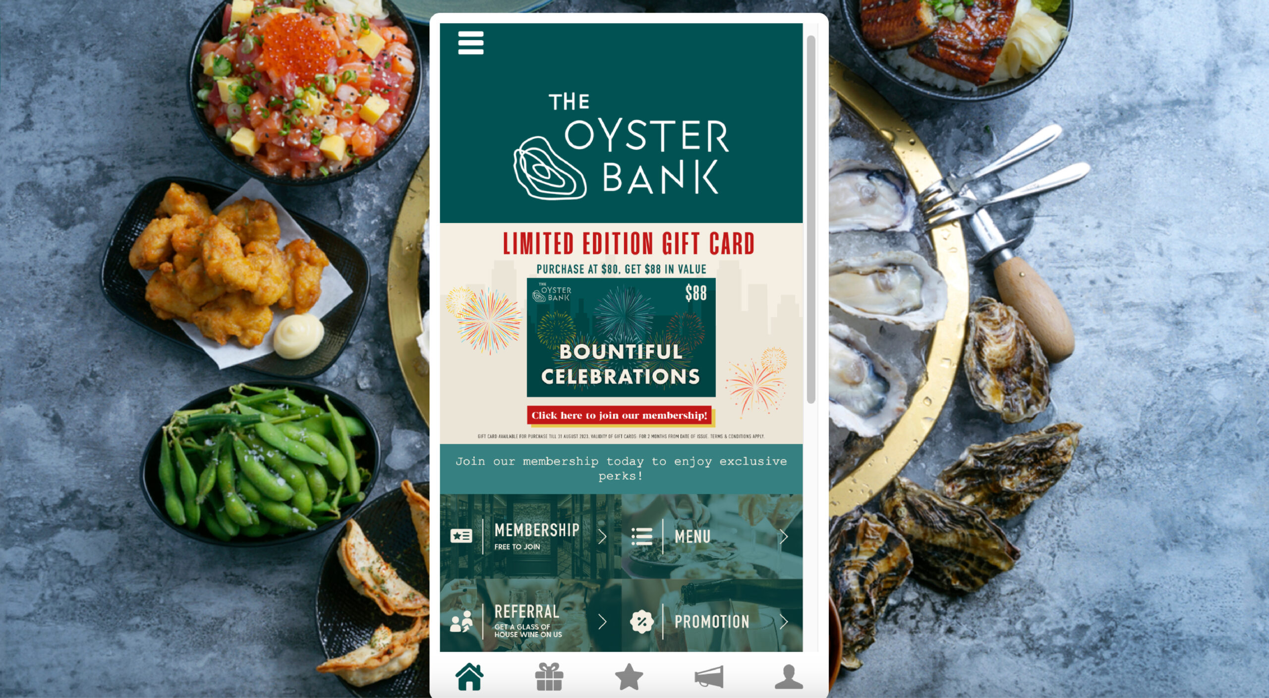
A clear and intuitive navigation system is crucial for guiding your members through your portal effortlessly. Utilize well-organized menus, logical categorization, and prominent calls to action to ensure users can easily find what they’re looking for. Remember, simplicity is key – don’t overwhelm your members with too many options.
Responsive Design
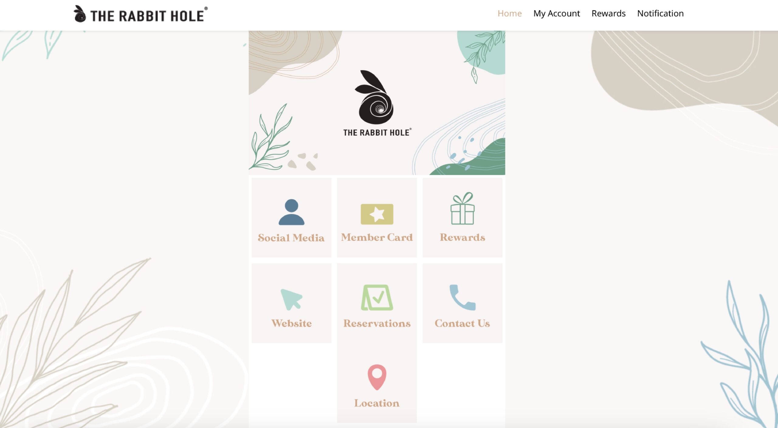
In today’s mobile-centric world, your portal must be responsive and adaptable to various screen sizes. Ensure your design looks and functions seamlessly across devices, providing a consistent experience for all members, whether they’re accessing the portal from a desktop, tablet, or smartphone.
Consistent Branding
Maintain a consistent visual identity throughout your portal by using your company’s branding elements such as colors, logos, and typography. Consistency instils a sense of trust and familiarity, making your members feel more connected to your brand.
Personalisation and Customisation
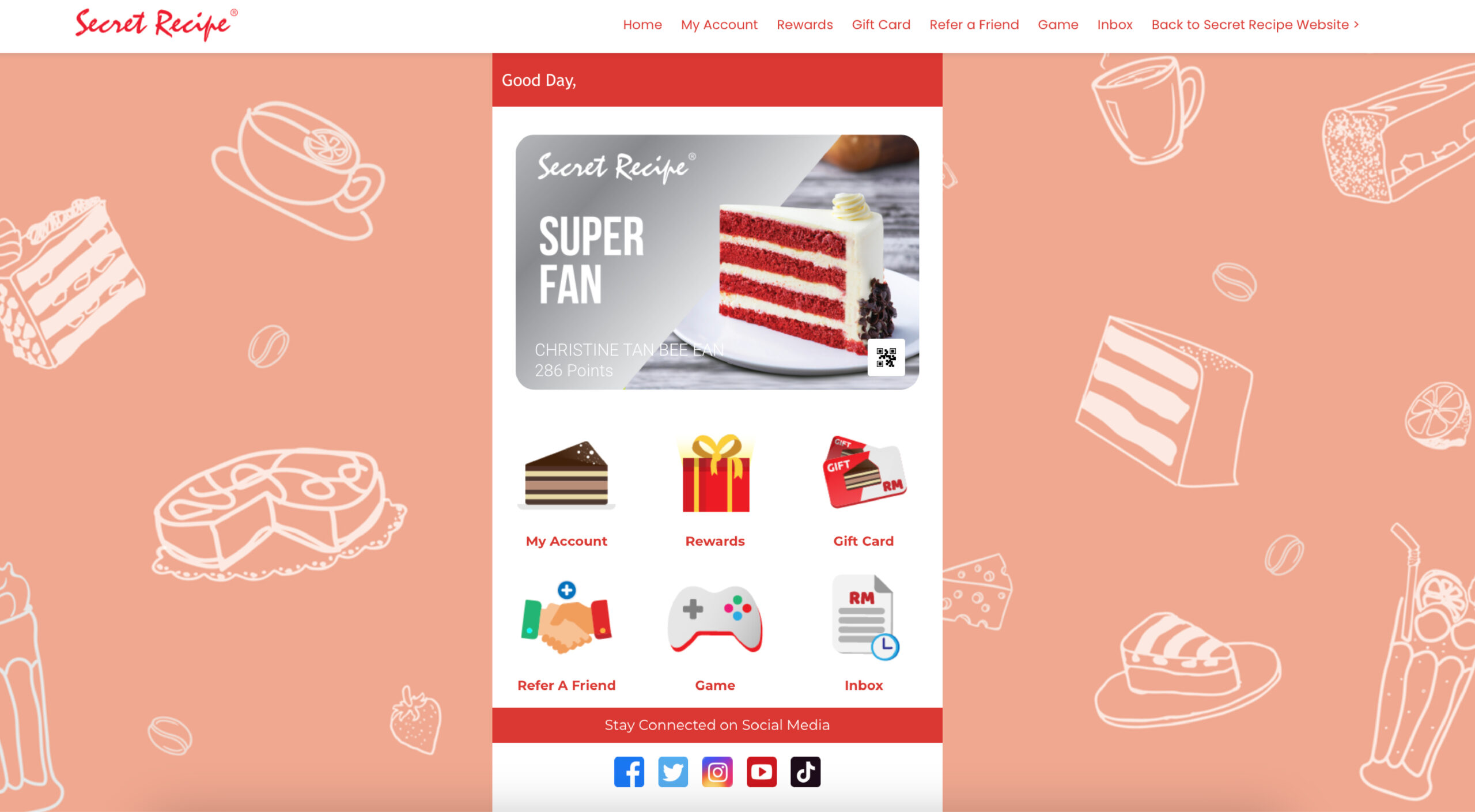
Empower your members by allowing them to customize their portal experience. Provide options for profile personalization, theme selection, and content preferences. Personalization enhances user engagement and helps members feel like the portal is tailored to their needs.
Clear Call-to-Actions (CTAs)
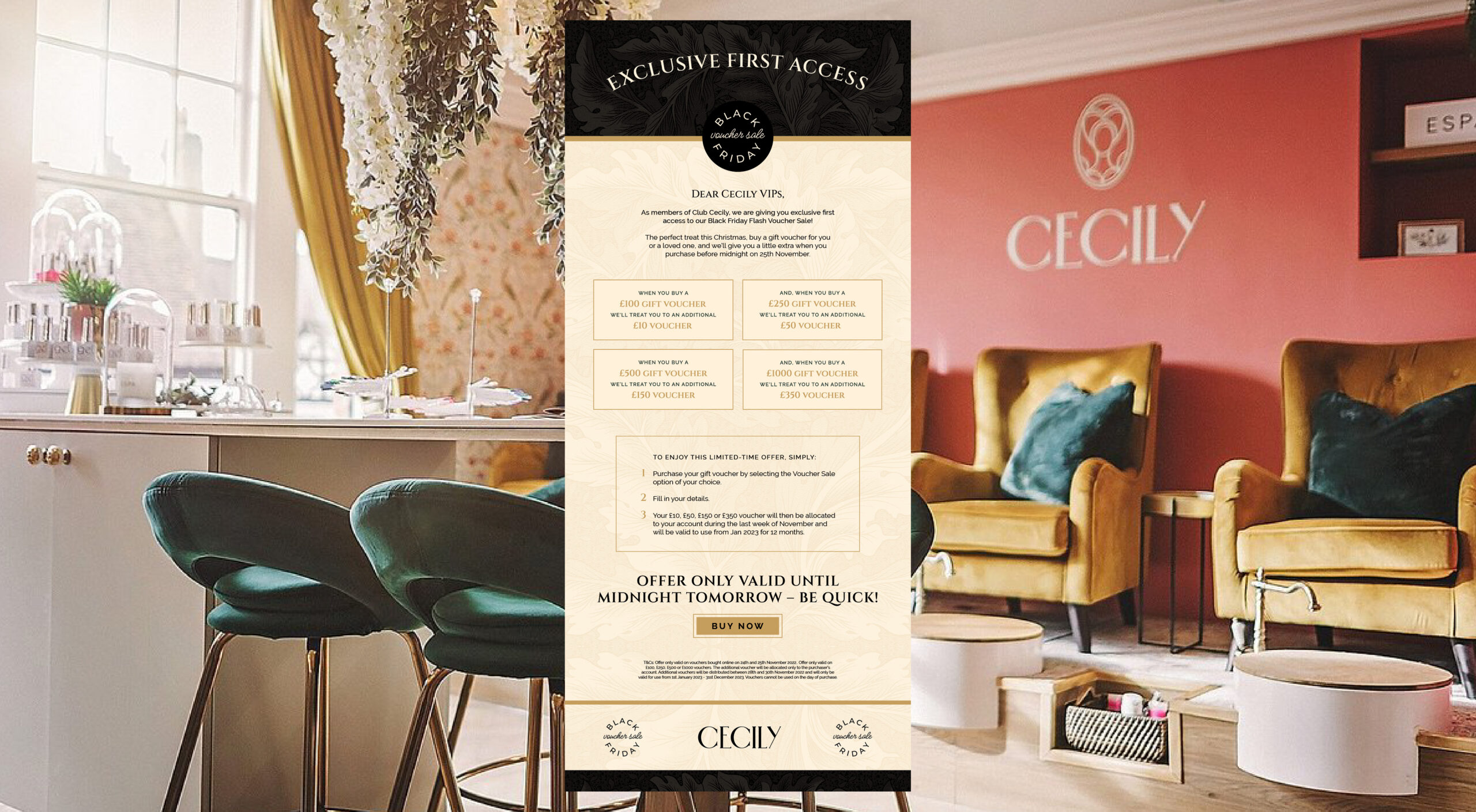
Guide your members towards their intended actions with clear and compelling CTAs. Whether it’s signing up for a new membership, accessing exclusive content, or interacting with community features, strategically placed CTAs drive user engagement and conversions.
Ready for more? We have just the thing for you! Eber’s Inspiration Gallery serves a visual feast of design ideas that can bring your membership portal to new heights. Click here to explore the gallery now, happy designing!
Eber is an all-in-one loyalty marketing solution that is ready to drive customer retention for businesses like yours.
Want to learn more before launching your own loyalty program?
Sign up for a free demo trial walkthrough with us today!

