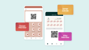
Better understand your customers’ spending behaviour with a cohesive dashboard that compiles all that you need to connect, engage, retain your customers.
Your colleague’s 20-slide PowerPoint presentation filled only with an endless amount of numbers and texts presented in that all-too familiar serif font that he didn’t bother changing only leaves you feeling more confused and sluggish at work. Yep, you’re not alone; boring presentations have become the ubiquitous workplace phenomenon that everyone loathes.
Thankfully, with the help of (you guessed it) technology itself, we no longer have to be subjected to this regular humdrum of an event at work. Long gone are the days where KPI or TPS reports are being presented in interminable Excel SpreadSheets or… in literal sheets of papers.
Today, the dashboards are taking over and have been a dire need for many organisations. Businesses from various industries have been popularly adopting this holy grail for numerous purposes — from monitoring the overall health of operations and benchmarking marketing campaigns to analyzing the productivity of customer loyalty programs and much more.
 According to Stephen Few, the dashboard is “a visual display of the most important information needed to achieve one or more objectives; consolidated and arranged on a single screen so the information can be monitored at a glance”.
You may or may not have seen a dashboard in action before — multicolored 2D pie charts and bars; rows after rows of tables; and interactive graphs that smoothly displays numerical percentages when hovered over, all integrated neatly into a sleek-looking platform.
From the perspective of a mathematical-phobe (like myself) dashboards may initially come off as an enigmatic tool that are only decipherable by analysts. The amount of numbers can be traumatic.

But really, it isn’t rocket science. Turns out, dashboards don’t discriminate; its interface is remarkably easy for anyone to navigate and visuals made simple enough to understand, be it for a beginner, intermediate, or advanced in data analysis or marketing. In fact, no form of mental calculation is even needed!
Of course not all dashboards are designed the same way; it isn’t the sort of thing where you could apply the one-size-fits-all concept, and it most certainly shouldn’t. Dashboards are built to be versatile enough to allow for customization in order to meet the exact needs of an organization.
With cutting-edge features of such, the dashboard quickly went from being just a mere tool that functioned as a complement to businesses to a priority in this very day and age — leaving many eager to find out what’s the big deal before taking the plunge to invest in one for their businesses.
User-friendly, cloud accessibility, versatile, easier to keep employees on track… the list of advantages are boundless. So, let’s get down to the nitty gritty — here are three key features worth highlighting:
Saves Time.
Imagine having to switch between three different Excel Spreadsheets just to compile a report. It isn’t impossible, but it’ll probably take you hours, as compared to accessing that very information on the dashboard within seconds (of course, depending on your internet connection speed). That’s a lot of time lost performing a tedious task that’s prone to human error, and you’ll also probably lose your sanity after you’re done.
In essence, the dashboard allows users to keep tabs on multiple data at once on a single platform and is able to automatically generate the latest reports on the results that have been compiled over a selected period of time.
Graphics.

We’ve spoken about data visualization and there’s no denying that graphics play a pivotal role in grasping the attention of people. But it isn’t really just about the look and feel of the layout; having a prismatic pie chart isn’t just pleasing to the eyes, but also benefits in helping users to understand the performance metrics better because it utilizes visual forms that are accessible to all.
The dashboard is able to simplify complex information without missing out on any relevant data. It is also visually informative yet minimal enough to not give the receiving end a headache from an information overload.
Dig Deep…er.
We know that the purpose of reports are to dig deep into the results. But with the dashboard, you’re able to dig much deeper into the collected results by breaking down larger metrics and classifying them into specific categories for the purpose of analysis.

Say, you were to run a retail store that’s equipped with a basic member loyalty program, and you’re interested to find out more about your total profit made last month. You have questions about who were actually making these purchases: Are they members? How frequent were they making purchases every week? How much have they purchased so far?
It gets even more detailed — How much did they spend between 30th November to 31st December? You get the point. Yes, the dashboard is able to give you that information instantly. This is particularly good for businesses as employees are able to examine metrics from an overall point of view, while also being able to drill down to deeper layers of information which may be presented from different angles for a greater insight.
Dashboards can bring you objective results that are more in-depth via visually informative and interactive representations with a click of a finger — truly, a crucial tool in staying afloat during trying times in the retail industry like what we’re facing now.


